top of page


Kanpai BBQ & Shabu
Website Redesign
Role
UI Designer, UX Researcher
Scope
Web and Mobile Design, Rebranding, Visual Design
Kanpai’s brand new website brings modern Japanese dining online with a clean design and intuitive navigation that reflects the restaurant’s warm, authentic atmosphere.
Timeline
Q1 2025
Team
Ellie Chen, Jasmine Tran, Tanvi Kuchimanci


Problem
The original Kanpai website created a frustrating user experience due to poor mobile responsiveness, limited navigation, and a menu that was only accessible through a PDF. Users often had to zoom in and out to find information, while broken links and a lack of visual content made it difficult to explore the restaurant's offerings. These usability issues prevented the website from effectively showcasing Kanpai's brand, atmosphere, and dining experience.
Mission
To create a modern and engaging digital experience that showcases Kanpai's unique dining atmosphere while making menu exploration, restaurant information, and customer engagement more accessible across all devices.
Goals
After meeting with stakeholders and evaluating the existing website, we established five primary goals:
-
Create a visually appealing website that boosts Kanpai's professionalism
-
Engage new and existing customers with stunning images of Kanpai's food
-
Improve the website's ease of use/navigation
-
Boost Kanpai's credibility and online presence by encouraging viewers to engage with Kanpai's reviews on Google and Yelp
-
Have a website that is up-to-date and competitive with other BBQ websites by aligning with the social media presence built.
Ideation Phase
Personas
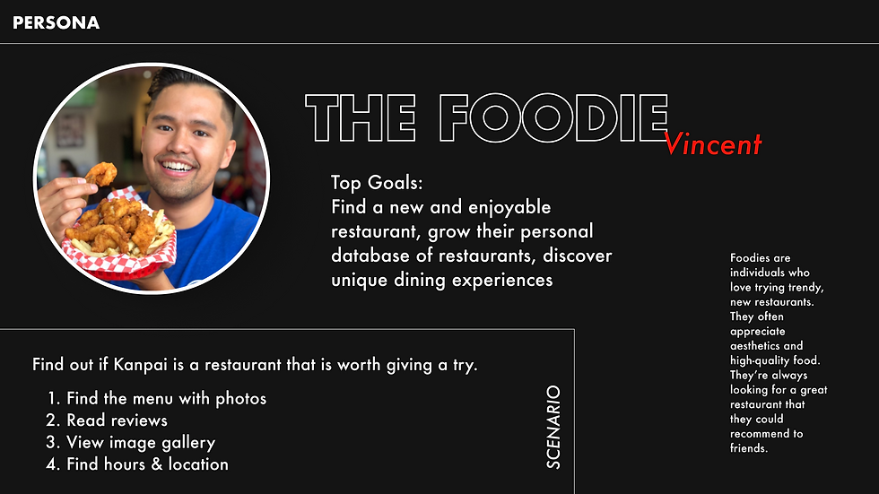
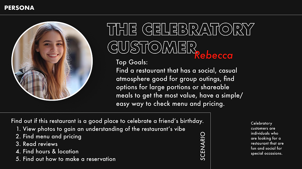
In order to start our design process, we first had to identify who we were designing for. We first started by interviewing the manager of Kanpai focussing our questions around what type of people go into the restaurant, what time they were there, for what occasions they were there, and overall how these people see Kanpai, not only as a restaurant, but as a brand. In addition to interviewing the manager, we had also placed QR codes inside of the restaurant to receive insights from customers as well as conducting interviews with our friends and family. After analyzing our collected data, we had landed on two personas to centralize our design process around.
Brand Identity
For the rebranding, we really wanted to emphasize the bold red color used in their logo and really allow it to pop out against a dark background. In addition to this red color, we also wanted to add a more muted color for elements that still held importance, but didn't require all of the attention. The font we decided to go with was a clean, non-serif font called Futura with varying typefaces for titles, headings, and paragraph text. These elements together created a clean and bold visual atmosphere that allowed images and important text to shine through the website.

Key Design Challenges
1) Homepage
The original homepage relied on a single long scrolling page that lacked organization and visual hierarchy. Users struggled to find important information, and the website failed to communicate Kanpai's unique dining experience.
We redesigned the experience around a mobile-first information architecture consisting of three primary sections:
-
Home
-
Menu
-
About
To immediately capture user attention, we introduced large food imagery, stronger branding elements, and clearer calls-to-action. We also incorporated restaurant reviews, FAQs, and social media integration to build credibility and increase engagement.
Before
After


2) Menu
The menu was previously presented as a PDF that required constant zooming and scrolling. It also lacked imagery and clear separation between BBQ and Shabu offerings.
We embedded the menu directly into the website and organized content into dedicated BBQ and Shabu sections. Food photography was added to help users better understand menu items while improving visual appeal. This created a more intuitive browsing experience and reduced friction for first-time visitors.
Before

After

After addressing the key design challenges on both the Home and Menu pages, we applied the same visual language, branding, and navigation patterns to the About page to create a cohesive experience across the website. With the core pages complete, we finalized our first prototype and prepared for user testing. This phase allowed us to validate our design decisions, gather feedback from users, and identify opportunities to further improve both the usability and visual appeal of the site.
Testing Phase
User Tasks
-
You and your friend are thinking about having dinner at Kanpai, but you're not sure when they're open. Check their hours of operation.
-
You've never been to a Japanese BBQ or Shabu restaurant before and want to know how it works. Can you find information on how dining at Kanpai works?
-
Since you're considering going. Take a look at the menu and decide what you want to order.
-
Spend the next minute thinking out loud as you explore the site. What stands out to you?
-
You want to get a sense of Kanpai's vibe before making plans. Find photos or videos that show you what the place is like.
Follow-up Questions
-
What was your overall experience using the Kanpai website?
-
If you could improve one thing about the website, what would it be and why?
Key Insights from User Testing
What worked well
Areas for improvement
Updates
-
The main photo, color scheme, and layout are visually appealing.
-
The menu is well-structured and simple to browse.
-
Social media integration and gallery photos showcase the dining experience effectively.
-
Items lack descriptions, making it hard for users to know what they're ordering.
-
The dining process is unclear and should be easier to find.
-
Dropdowns on the menu page don't always work smoothly.
-
Add menu descriptions for meats, vegetables, broths etc.
-
Include ordering process details on the home page or menu page.
-
Fix dropdown functionality for seamless experience.
After analyzing the feedback gathered during user testing, we made several revisions to improve the prototype's usability, clarity, and overall visual appeal. These refinements allowed us to address key user concerns while maintaining our original design goals. With these final adjustments and more feedback from our instructors, we moved forward with completing the final Kanpai website redesign.
Reflection
Being able to redesign Kanpai's website was a great opportunity for me, not only to gain more experience using different tools for prototyping, iterating, and designing, but also to work with a business and solve a real-world problem. It was great meeting with our client regularly to communicate updates and discuss design decisions before implementing our ideas into real designs.
The tight weekly deadlines and the tangibility of a real product raised the stakes beyond the classroom and made the completion of the final product more rewarding. It feels good to know that a product my groupmates and I designed is published for people to see and use right now.
I would like to thank Professor Kirsh and his teaching team, manager of Kanpai BBQ and Shabu Ronnie, and my groupmates Ellie, Jasmine, and Tanvi for helping to create a great final product.

Final Kanpai BBQ and Shabu Website Redesign
Thank you for your time!
If you have any questions, feel free to reach out and contact me.
Check out my other projects!


bottom of page